Traditionally, this time of year presents a good opportunity to priests to slow down and do work which is neglected in busier times — planning upcoming programs, preparing retreats, etc.
Well, that hasn’t worked out for me so far, since I’ve been inundated with last sacraments and funerals. (To put this in perspective, it’s probably just another day in the life of a city priest!)
Still, I have had time to master a remarkable new WordPress theme which Elegant Themes released just before Christmas. The theme is called Divi, and it makes use of an inbuilt Page Builder to make WordPress more versatile and WYSWIG than ever. If you don’t know what that means, then just take it from me: the Divi theme is outstanding, and if you know anyone who uses WordPress, alert them to this release. It might change the way they use WordPress. It certainly has for me.
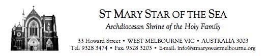
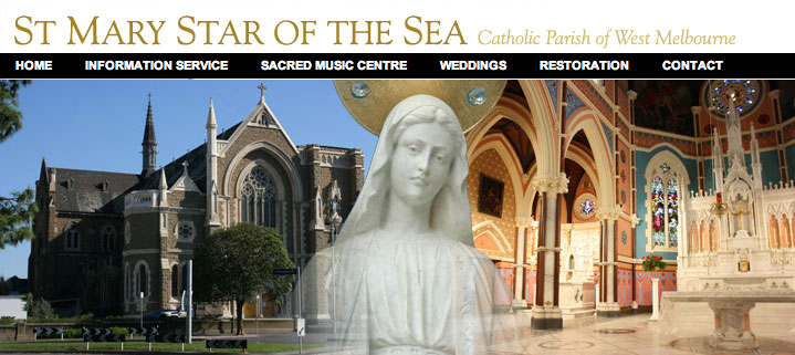
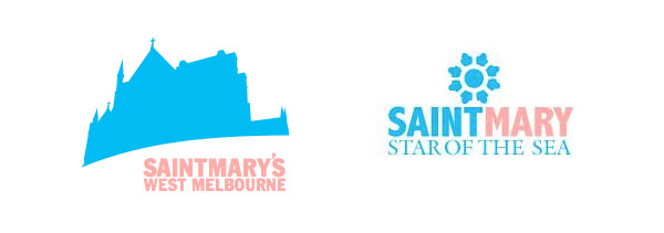
I intend to migrate all my websites over to Divi in the next few months — this blog included. I started this week with stmaryswestmelbourne.org. The website incorporates a new parish logo, which was designed by a friend (and some-time blogger), Alice Mount:
![]()
Alice is a professional designer, and she is presently working on a ‘coffee table book’ which will showcase the remarkable beauty and history of St Mary Star of the Sea. Here is how the design of the logo evolved.
In the first place, St Mary’s has used a line drawing of the church in its branding for as long as I can remember. (I became involved in the parish when I started at university, in 2000.)
Church line drawings are very common. I can still remember going to Mass as a kid, and seeing line drawings of St Alipius’ and Ss Peter and Paul at the top of the parish bulletin.
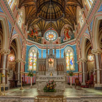
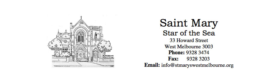
However, this particular line drawing became problematic when the restoration of St Mary’s rendered the drawing obsolete. The trees are long gone; so too the perimeter walls. So for print purposes, I designed a new letterhead, which incorporated a photo of the restored church:
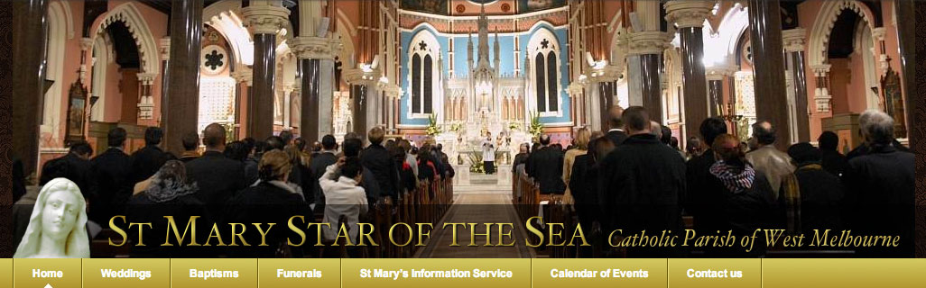
The electronic branding, however, took off on another trajectory. Here’s a sample of some of the banners I’ve used over the years, which demonstrate not only my changing web design skills, but also online trends and fashions. In 2006:
In 2008:
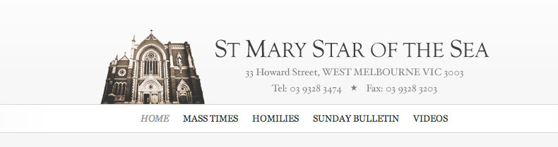
In 2010:
In 2012:
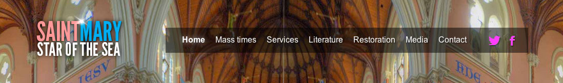
Each has its strengths and weaknesses, but with the possible exception of the 2010 version, they are all peculiar to the web. None of them are easily adapted to print and other media.
Alice’s task was to develop a new logo which could be used across all media — print, web, Twitter, Facebook, you name it.
To start with, she took the basic design element of the print logo (the church), and the colour scheme of the most recent online logo, (blue and pink evoke St Mary’s restored exterior). Here are some of her first drafts:
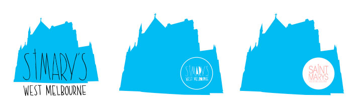
Speaking personally, I liked the use of the silhouette, but I wasn’t a fan of the modern font. I think it’s a bit too funky for a gothic church like St Mary’s. Among these, the third was my favourite, because it incorporated the two colours which dominate church the interior.
Alice’s second round of logos were quite different:
I like both of these, but I preferred the second one more. The problem with the first design is that at small scale, it’s hard to make out the shape. You need to see the cross and parapets to know you’re looking at a silhouette of the church.
The strength of the second design is that the rose window — three of which adorn the church — is also evocative of a star, in reference to our Lady, star of the sea.
The design Alice settled on, however, is my favourite. It has all the strength of the second design in the second draft, and then some. It is equally adaptable to print and electronic media. It scales very well — as the new website demonstrates. It incorporates the colours of the church’s interior design, and it incorporates the shape of three of the church’s windows, which also relates to the church’s title. Win, win, win.
![]()


The website looks beautiful! The rose window/star also looks quite like a ship’s helm or wheel which seems even more appropriate!
Thanks Laura. Incidentally — this is not causally related to your kind comment! — I’m adding you to my blogroll. Your blog is brilliant!
This my star of the sea or star of the west! I live in west warrnambool ! The star is in on my bedroom window in the backward! So not many people see it! I take photo of my family crib in the coming days!
What program was used to make the logo?
I don’t know for sure Samuel, but my guess is that Alice used Adobe Fireworks. I’ll ask her via FB and get back to you.
(My own efforts were created using The GIMP when I was poor, and Photoshop Elements when I was less poor.)
: ) Still laugh thinking back to a prayer we read together from your ipad.